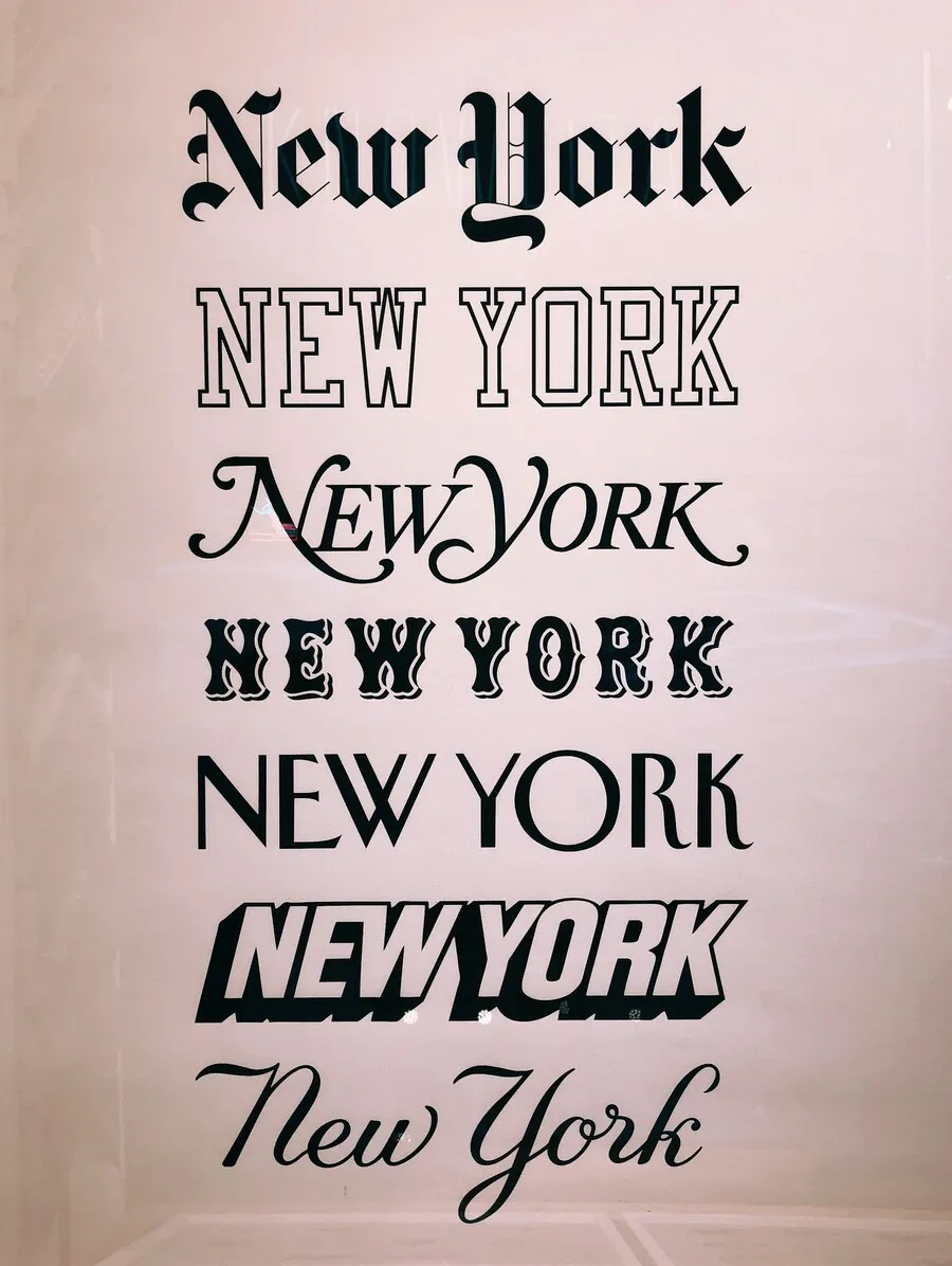
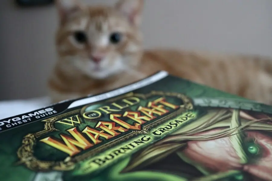
Websites developed with interactive Web designs are one of the key factors for online sale and purchase in the Internet era. Let us see what are the determining factors of the complex fonts in the website help for dazzling success. Typography has to be worked out properly, as content is the king of website. Fundamentals that maximize readability and improve look of website are Contrast, Hierarchy, Space and Size.
Steps that need to be taken care:
1. Scale and Proportion in fonts:
Fonts can be categorized as either similar fonts or different fonts. Fonts that are of it kind will not have positive impact on website as they look stranger when placed together. Hence for catchy headings, quotations etc., different fonts should be used. For ordinary content, similar fonts can be used.
2. Uniform Look and feel with color or style
Giving different colors with different styles will create headache to visitors of site. Pleasant css (cascading style sheet) should be used as it gives control over the text that got displayed. But it should be a meaningful one with the existing weight and emphasis of particular fonts.
3. Priority of fonts
Some fonts possess the attractiveness image by itself, while few do not. Hence a limit of mixed fonts according to the impressions it has, needed to be chosen and it will make the website more elegant. If lighter fonts happen to get used, adding style, font decorations and coloring can enhance the attractiveness.
4. Similar fonts
Similar fonts can create bad impression on the website. Fonts like Verdana and Tahoma or Arial and Helvetica can bring only similar effect and hence the best results cannot be achieved. Same font with different font decoration can illuminate the site rather than similar fonts.
5. Readability in fonts
As content is the king for any website, more rating always being there for a web page if it has readable body text. Fashionable colors and designs can be given in navigations, heading, title etc., but always body text need to be in plain and simple with an easily understandable font.
6. Attractiveness with the same fonts
As multiple fonts create headache, attractiveness can be obtained by mixing Italic, bold, small capital letters, all capital letters within the same fonts.
7. Trusting with the design
Once the web page is prepared, it is always good to take second opinion and to be looked into a big picture so that minor errors are rectified between mixed fonts and thus stunning look and feel can be got.
8. Calm background color
If happen to mix different typography, calm background color will help instead of background images.
9. Avoid highly noticeable fonts
As the web page has links to other pages as well, avoid highly noticeable fonts in the link section. That will lead not the current web page to be looked.
10. Quality
It is always not good to have maximum number of mixed fonts in a page. Using same attractive font in readable manner itself can bring quality of a page.
Conclusion:
Website design is a fun and it can be rated according to the creativity present in it. Cool, pleasant and elegant typography in the webpage will attract more visitors towards it. Multiple mixing of different fonts will not lead the website to be more readable. Mixture of creative fonts can make dynamism in the website, but at the same time, excess mixing will result in failure. By following the above said rules, one can conquer in the web page design.


